Making AppendX
(AppendX is available on the App Store now. You can read more about what it does at AppendX.to)
Background
My markdown vault (really, just a directory full of .md files) is where everything is stored. I use this compendium for three distinct modes: Capture, Execution, and Reference.
Capture
Where I gather text, links, and other resources from social media, the web, news, wikipedia, everywhere.
- Inbox: new tasks/ideas are put into a queue
- Scratchpad: where I copy/paste things i want to quickly edit, or where i write drafts
- Shopping: I add items I need from walmart/home depot/etc.
- Bands: jot down the name of bands/artists I see mentioned
- Movies: record movie recommendations
- Quotes: I like to save interesting/inspirational quotes
- Search: things I want to search the web for later, when I have some idle time
- Sites: websites recommended to me or that I want to visit later
You can see that these are all over the board. Without this system, other tools could suffice…
I could bookmark things, which would tie them to one browser (and when’s the last time you went through your bookmarks? be honest.)
I could use Apple Notes, but that would limit my access to only my Mac and iOS devices (yes, I can access iCloud from my PC, but it’s janky)
I could use (insert name of book tracking, music tracking, movie tracking websites here) but that would put each of those items into a silo — a silo that somebody else owns, a silo that lives in its own app or website.
So, I capture to my markdown files.
Execution
My Project files live in markdown also.
- websites
- apps
- house projects
- job search
- bike repairs/restoration
- researching topics
Some of these come from my markdown template and have formal structures: Project, Next Action, Purpose/Principles, Outcome, Tasks, Brainstorming. They’re continuously updated as I make progress.
Reference
I have reference files for … nearly everything I interact with. Model numbers, part numbers, service history.
- Vehicles
- Household Appliances
- Televisions
- Game Systems
- Printers
- Power Tools
- Computers
- etc.
I document all these things so I never have to wonder “what’s the right water filter for the fridge?” And since these files are synced to all my devices, they’re available to me everywhere, whether I’m at home or out.
Productivity people call this the “outboard brain.” Some folks turn their system into its own meta-project. I’ve even seen people who take it so far they get frustrated with it - I’ve seen clickbait titles like “I deleted my outboard brain.” I think maybe they missed the point somewhere - a system like this is supposed to reduce friction and hardship rather than become a new source of friction and hardship itself.
So… Why an App?
Let’s look at the old Capture workflow. I’m in my ‘dads’ Slack. Someone posts to our ‘#recommendations’ channel about a new movie they liked. I copy the title or the link to imdb or whatever. I switch to the app where I maintain my markdown files. I scroll through a huge list of files and find movies.md. I open the document and scroll to the bottom, make a new bullet point, paste the text.
friction, friction, friction.
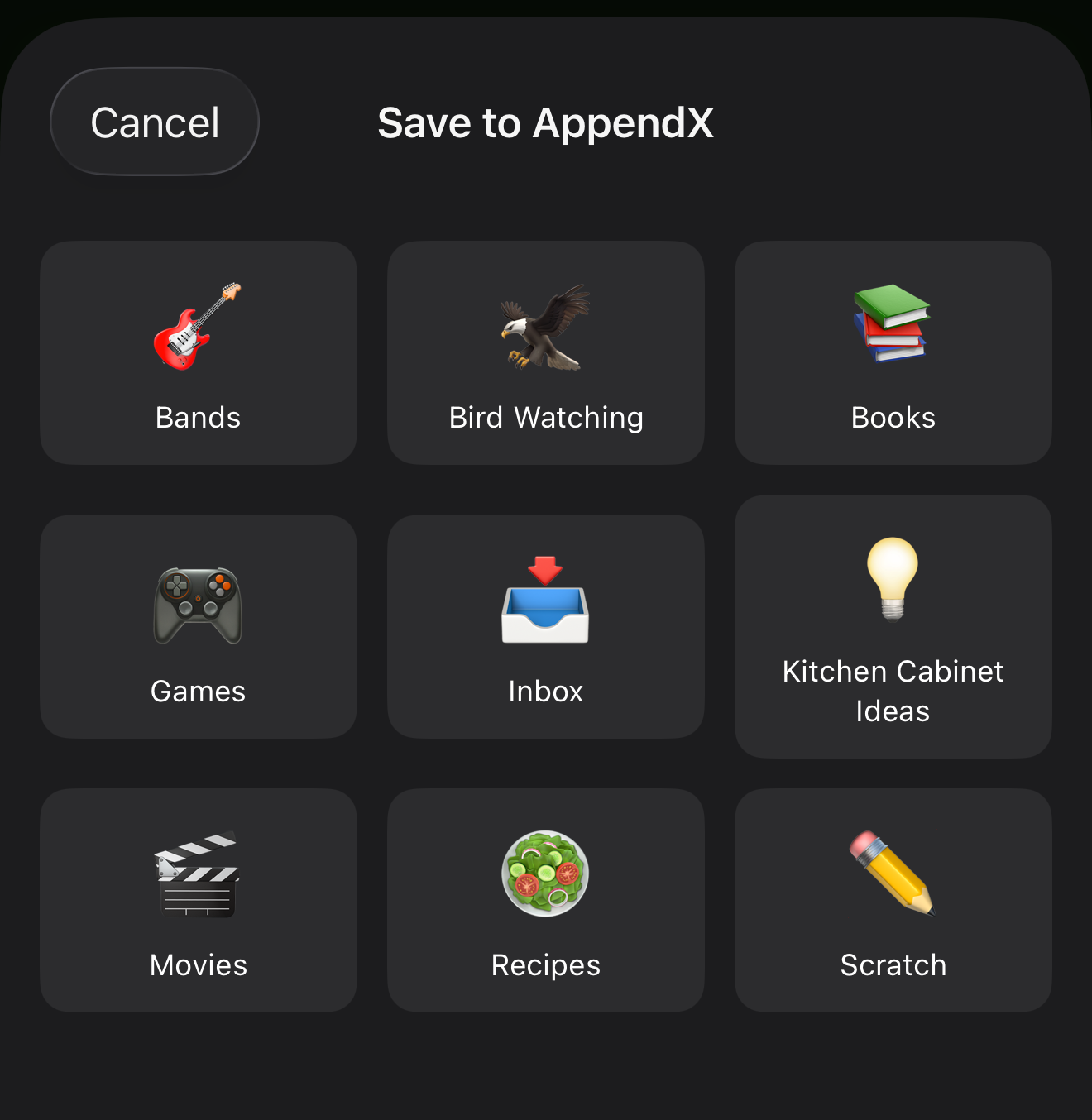
Let’s imagine a new way. I select text, tap, Share. pick an app, tap on ’🎬 Movies.’ done. The share-sheet closes and I’m right back in Slack.
This is exactly what AppendX does. It removes friction.
The Making of AppendX
The first thing you might think when considering a new app, might be “where do you find the time?”
While I had this idea in my head for a while, I didn’t formulate a plan until I found myself unemployed. Sure, plenty of people develop excellent and useful apps while simultaneously working a full-time job, but what I found is that this was the first time my brain was free to consider the possibility of something completely outside my comfort zone.
30 years of web development experience includes a lot of different technologies, but I was completely new to Swift, Swift UI, and the Xcode/App Store Connect ecosystem.
I Turned to some Friends for Help
I’ve used Claude to help draft specifications for a while. This project followed our typical workflow:
I spell out in detail what I want to accomplish, the technologies I want to use, and any dependencies or constraints.
I ask Claude to create a new PROJECT document in (surprise!) my markdown vault, using my Markdown Vault MCP server. I give claude read/write (“edit”) access.
As the conversation progresses and I make more design decisions, Claude updates the document with me, and we ultimately arrive at a fully-formed design specification.
(Claude Desktop is usually using a higher-cost model for this planning stage, like Opus. Claude Code is configured with a lower cost execution-focused model, like Sonnet).
Here’s where I make a choice about the best path to write the code: sometimes I might choose to build the project from that specification myself. Sometimes I’ll get coding assistance from a local model. Or, sometimes I’ll have Claude Code build from the specification, with my approval turned on at each change. This lets me verify architectural decisions, ask clarifying questions, and ultimately be responsible for the quality of the output.
Since I hadn’t written a line of Swift before, I chose to use Claude Code this time. At each stage of development, Claude Desktop and I would isolate a finite piece of functionality, then hand that specific part to Claude Code. Claude Code would execute, with me checking each step, then write a summary of all the work that was done. I would then turn back to the higher cost model in Claude Desktop where we would review and verify CC’s output.
Basic Training: Xcode
Since I hadn’t used Xcode before, this was the first hurdle when establishing a project. While it looks like a lot of other coding IDEs, there are a lot of configurations necessary for creating an app that you eventually want to release. Thankfully, that’s another aspect of this project where my friends have experience - setting the details for destinations, provisioning profiles, certificates, app groups, etc. These are all things that Claude knew about, so I had a guide for doing these things for the first time.
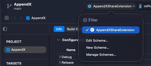
Besides the routine configurations, Claude also knew about various gotchas before I had to go searching the web. The App Scheme for the overall app periodically disappears from the list, causing me to accidentally archive and (attempt to) publish a build consisting of just the sharing extension. iCloud Document access mysteriously missing - because you need to upgrade to a paid developer account (something I had planned to do later in the process, but turned out to be essential for beginning it). These things would have sidetracked me to research ‘what the heck’ but thankfully, Claude was trained on the solutions.
The Sharing Challenges
Initially I had envisioned that applications were going to hand over rich text that I would need to format in markdown. I created a RichTextConverter in anticipation of this. But through my testing, I discovered that none of them did. So that code went on the shelf.
What they hand over instead is inconsistent in ways I wasn’t prepared for. Sharing an article from the Wikipedia app gives you a bare URL and nothing else — no title, no text, no metadata of any kind. YouTube sends the URL as plain text and populates no URL field at all. Apple News URL-encodes your selected text into a URL query parameter, where no reasonable person would look for it. Maps hands you eleven kilobytes of opaque blob plus a ten-byte attachment containing the only human-readable thing in the payload.
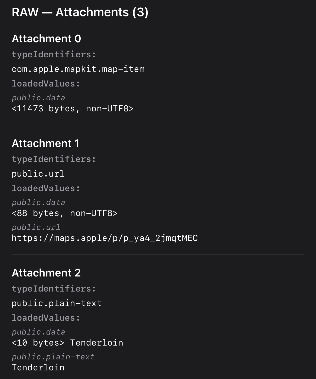
I already had a debug view — an #if DEBUG screen I’d been using since early on to see what came through the share extension. That’s how I collected the corpus in the first place: long-press the sheet, dump everything, copy it out, move to the next app. Fifteen of them.
That corpus became the normalization layer: a short pipeline that promotes a URL out of a text field when an app puts it in the wrong place, decodes the Apple News parameter, strips tracking junk, and generally tries to turn “whatever this app felt like sending” into “the thing the user meant to save.” It also became a regression suite. Every time I changed the extraction logic, I re-ran all fifteen and diffed the results.
The Finding That Was My Own Bug
The findings were strange enough that I wanted to write them down, for other developers and for myself. So I started a post.
And in the course of writing it — re-testing to verify my claims — I found that one of my best findings was my own code.
I’d written up that a dozen apps were sending their own hostname where a page title belongs. Wikipedia handing me en.wikipedia.org. Bluesky handing me bsky.app. It was a good finding. It was also entirely my fault: when an app sent no title at all, my own normalization was filling the gap with the URL’s hostname. The apps weren’t sending junk. They were sending nothing, and I was manufacturing the junk myself.
The problem was that the debug view showed me my own parsed output and presented it as though it were what the app had sent. There was no line between “iOS handed me this” and “my code decided this.” Fifteen captures, all filtered through a lens I couldn’t see. The fix was to stop trusting my own output. I rebuilt the debug view to print two labeled sections — RAW, exactly what the app provided, and NORMALIZED, what my code did with it — and to print empty fields explicitly rather than omitting them. Absence is a finding. Omitting it is how I spent a week believing something that wasn’t true.
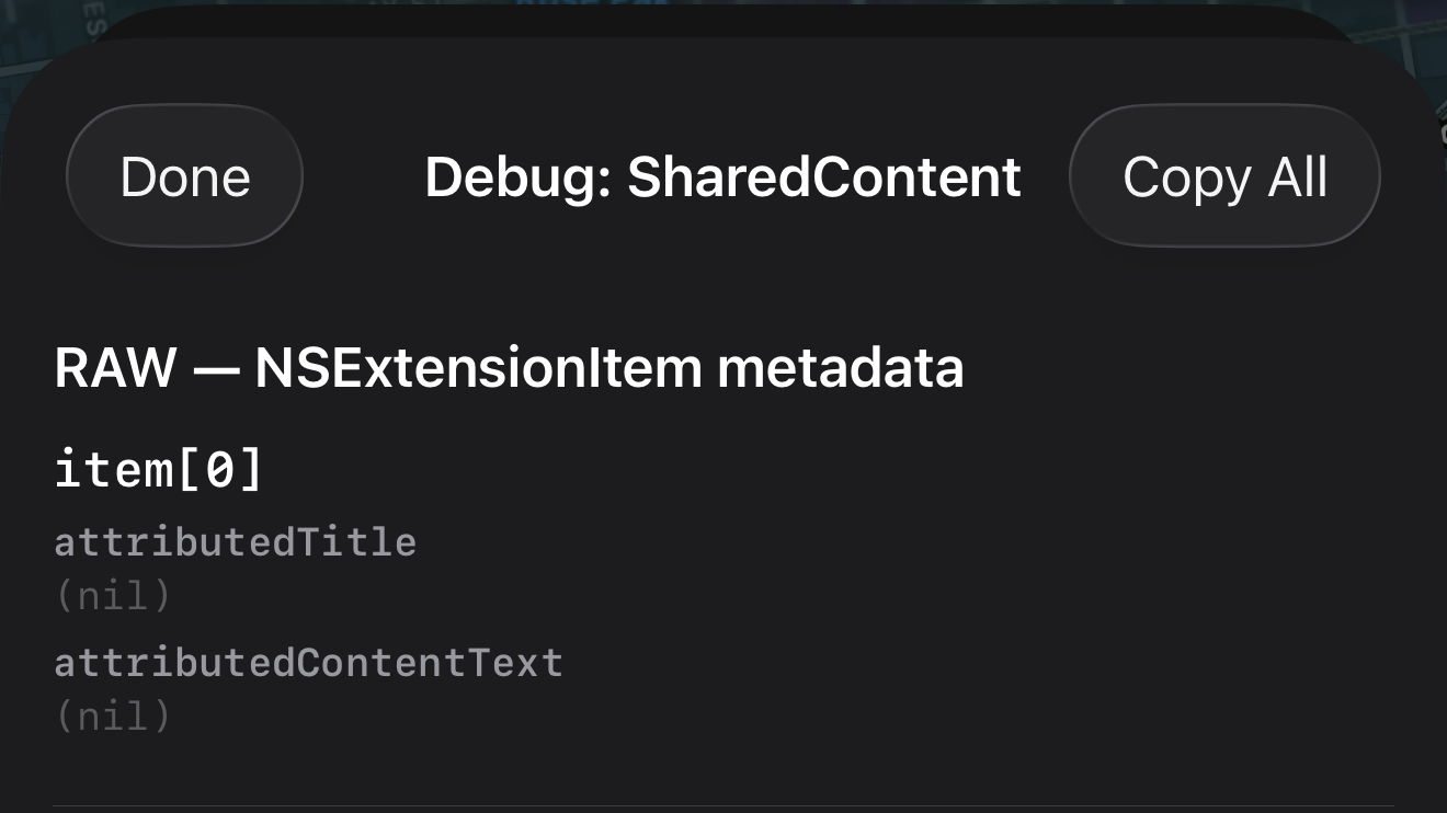
Re-running the corpus against the new dump turned up four more bugs. Some were my assumptions. A couple were places where Claude Code had confidently traced the Apple News parsing logic and gotten it wrong — twice, with the same case, which is its own lesson: the trace is not the verification. It also disproved two of my seven normalization rules, which I deleted. The pipeline that shipped has five steps.
You can read the whole sharing expedition in What iOS Shares.
The UI That Lied
While I was using it, I noticed the share sheet was telling me something reassuring and false.
Under the preview I’d added a little completeness indicator. Green checkmark, “Everything captured.” Useful, because different apps hand over different pieces and I wanted to know at a glance whether anything was falling on the floor.
Then I shared a Wikipedia article to a target using the raw format and watched it say “Everything captured” while quietly discarding the URL.
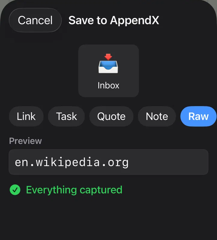
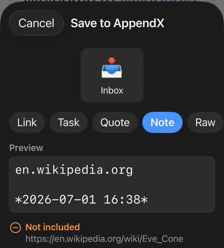
The logic was reasonable, but wrong. It checked whether the template’s tokens had values — not whether all the data I’d received actually made it into the output. So a template that didn’t reference the URL at all reported success, because nothing it asked for was missing. It was answering the wrong question with total confidence.
For an app whose entire pitch is “never lose data,” a UI that lies about losing data is worse than one that crashes. A crash you notice.
The fix wasn’t a better checkmark. It was to stop asserting and start showing: the preview now renders the actual captured content as it will appear in your file, and lists anything being dropped, by name, with its value. If the URL isn’t going in, you see the URL sitting there in a “not included” line. You don’t have to trust me. You can read it.
There’s a pattern here I keep running into. The debug view told me what it thought instead of what it saw. The completeness indicator told the user a conclusion instead of the evidence. Both were confidently wrong in the same way, and both got fixed the same way — by showing the work.
The UX Refinement
Simplified Capture Options
Initially, I designed several different means of output in your markdown files: link, task, quote, note, and raw. Further, each of these types could be customized by the user.
Then, through using this on my phone every day, I realized that the shape of what is being captured was much simpler: a list, or a block. Then further, for a list you may want a checkbox, or a date. For a block, you might want separators between, and a date.
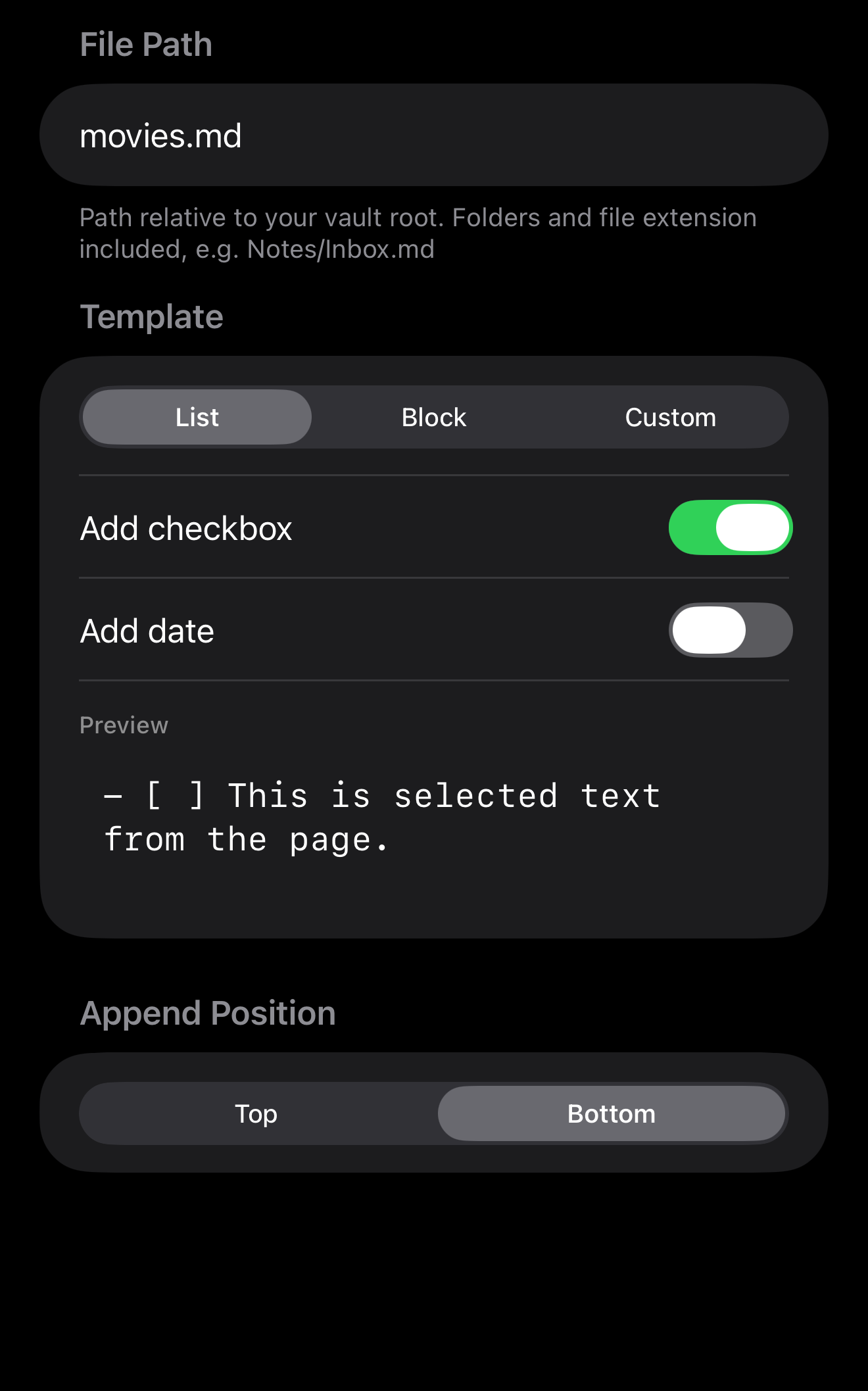
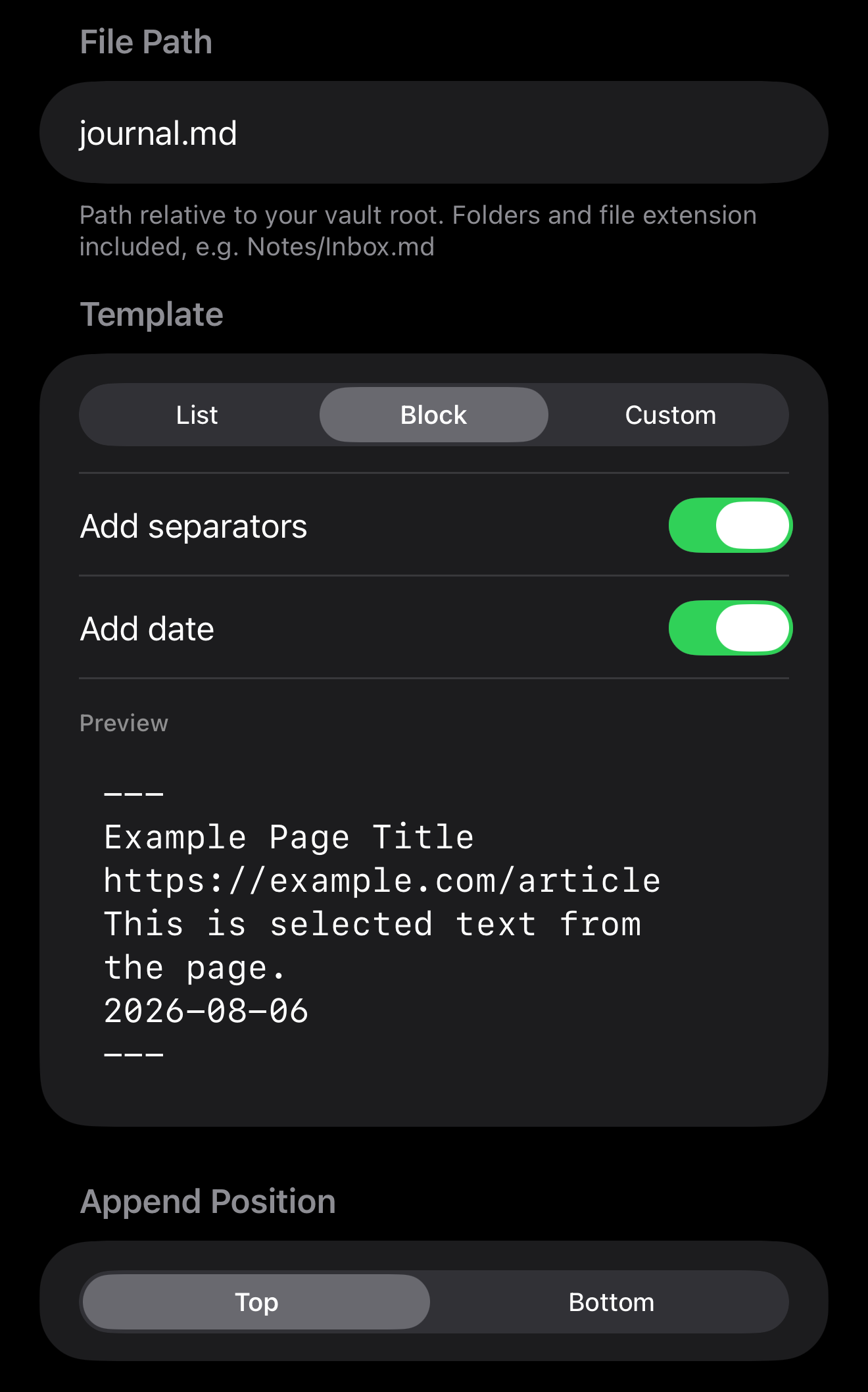
These simplified options actually retained most of the power that was available initially, but they broke down the decision making into steps. The user wasn’t left staring at a list of tokens to insert into a template, they are making a series of simplified decisions. I don’t think I could have arrived at this vision without having used the app and iterated upon my initial idea.
Helping With Emojis
Somewhere in here I got precious about target icons.
Emoji are the right choice for this — you scan a grid of nine targets and 📚 registers faster than reading “Books.” But making the user hunt through the emoji keyboard every time they add a target is friction, and friction is the thing I built this to remove.
So AppendX suggests. Type “Bird Watching” and you get 🦅 🪶 🔭 to pick from. “Mushroom Foraging” gets you 🍄 🌲 🧺. “Mechanical Keyboards” gets ⌨️ 🖥️ ⚙️.
The obvious way to build this is an API call — hand the name to a model, get an emoji back. Works for literally anything. I decided against it. It would mean a backend to hold the API key, a per-suggestion cost, and a network dependency, all for something a user does only a handful of times on initial setup.
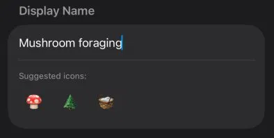
What it does instead is run entirely on the device: Apple’s NLTagger pulls the nouns out of whatever you typed, those get matched against a keyword map, and anything that misses falls through to broader family buckets so “bird” and “mushroom” and “stargazing” all land somewhere sensible even if the exact word isn’t in the list.
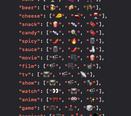
It’s more code than the API call would have been. But it’s instant, it works on a plane, and it costs nothing to run — which for a free app is the difference between a feature and a liability.
The Widget Side-Quest
In the back of my mind, I was still disappointed about the lack of rich text available in Sharing. Through my research I knew that the rich text was waiting there on the Clipboard. Someone on Mastodon wished out loud that browsers had a native “copy as markdown,” and it was the catalyst for my next idea - an iOS widget that could invoke AppendX with a text input to add to your file target directly - with a button to paste formatted markdown. My RichTextConverter has a purpose after all!
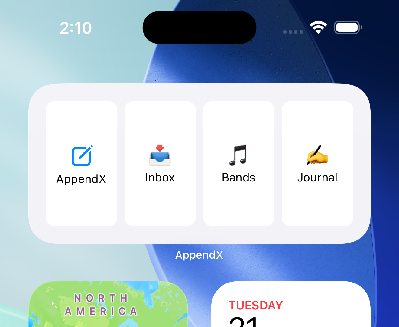
The challenge for me, however, was that Widgets are finicky, especially ones where you want the user to be able to make changes within your app, and have them reflected in the widget simultaneously. My lack of experience with iOS development really hampered this feature, as recording, maintaining, and syncing state for which targets to have in the widget became problematic.
So my next deduction was to reduce the scope of the widget to only invoke the capture mode in the app. It would be a second tap to choose your target. It felt like a compromise that was okay for a 1.0 product. But quickly thereafter, I realized a single-use widget was about the same as tapping on the App icon itself.
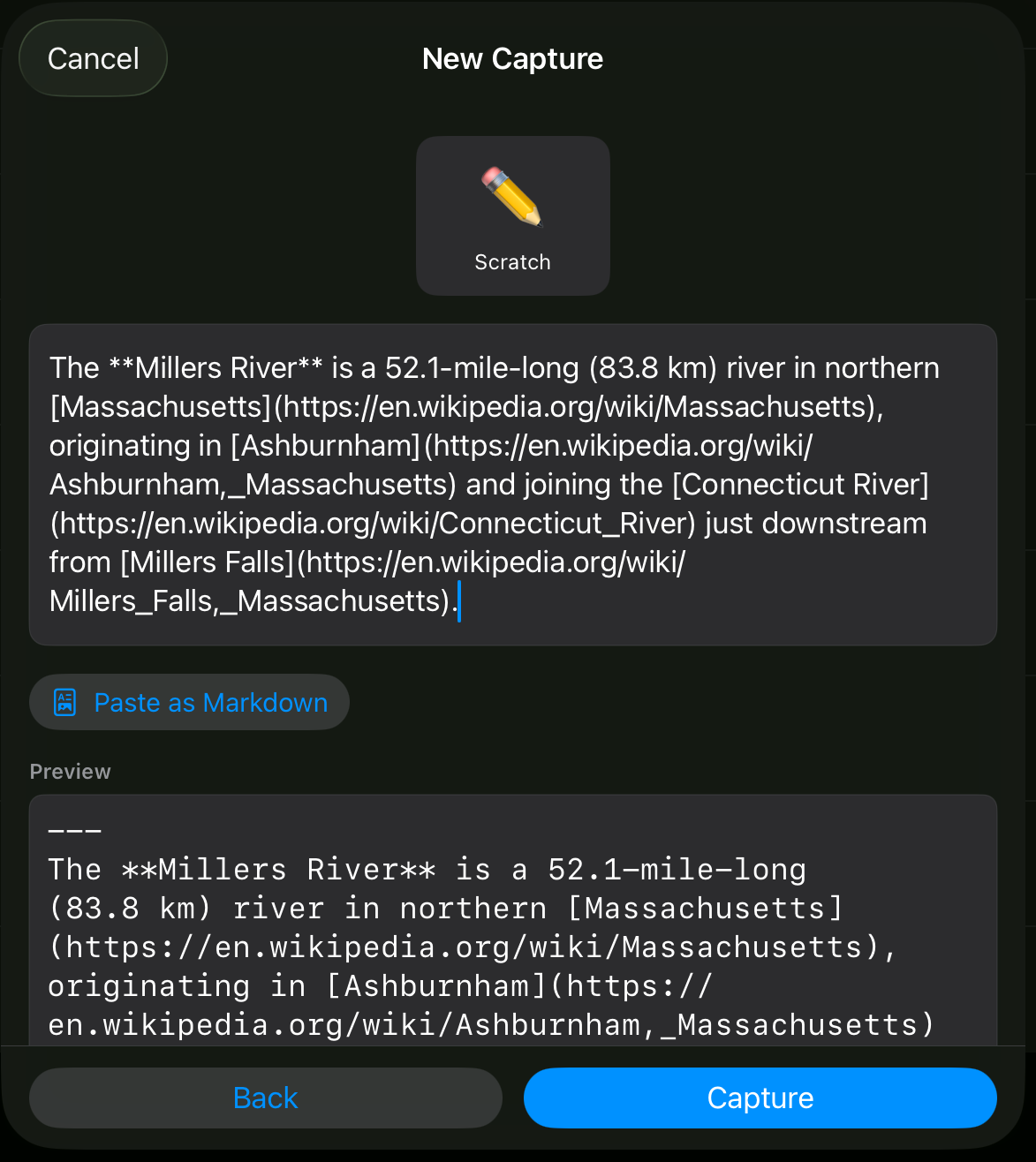
So, the text input view remains in the App. You can paste, type, quickly edit before saving, even use the iOS microphone to dictate what you want to capture. And the Paste-as-Markdown button will convert the rich text that you copied.
The Final Boss: Apple App Store Connect
The stark contrast between publishing a website, and publishing an iOS App Store app, cannot be overstated.
I’ve built up my skills and infrastructure over the years to where I can:
- register a domain name
- configure DNS
- create a git repository
- code a landing page
- do a quick configuration in Coolify
- publish a website
within a few hours.
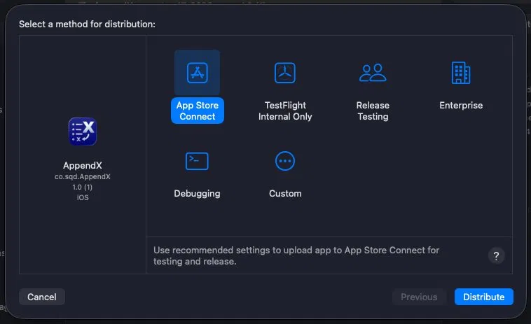
App Store Connect is a gauntlet. I had anticipated that there would be more paperwork since my app has a modest, yet non-essential In-App-Purchase “tip-jar” built into it. (Luckily I had already created a business entity with the IRS years back when I was a freelancer.) But the parts that caught me off-guard were procedural things that were hidden all over throughout the website:
- age ratings
- countries of distribution
- individual costs per country (thankfully, Apple helps with this one)
- privacy policies
- data collection policies
- screenshots of mysteriously specific sizes
That last one really got me. In addition to the screenshots you provide as part of your App listing (that are seen by users browsing the App Store) there is a separate one provided just for the App reviewer to see what the in-app purchase looks like within your App. The documentation says you can use any size that is acceptable in the actual product listing. Except, the only one I was able to get it to accept is 1242×2688. Write that down somewhere.
The Icon




Here’s another thing that seems like it should be easier, on the face of it. An icon is a picture, a picture can be created in various softwares. That’s not true anymore - Apple now ‘composes’ icons, so they can have different spectral effects and coloring applied at different layers. The “Icon Composer” app is a bit of a learning curve, but not unfamiliar from all the various graphic design apps I’ve used over the years. It was just an obstacle, needing to learn yet another new thing.
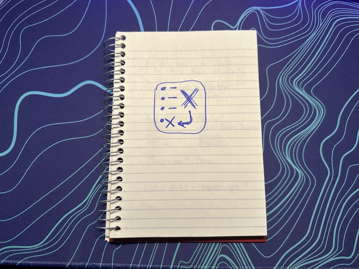
I know my icon is pretty basic. Not being a recognizable brand, I chose to make my icon to try and convey what the app does. And I had to set myself apart from all the other apps with a giant ‘X’ as their icon. There are a lot of them.
The Name is a Pun
If it wasn’t obvious already - the X is a variable. The idea of making it only append to existing files came from my Markdown Vault MCP server - one of the user-defined permissions that you can set per-file is ‘append.’ So using the MCP Server via an AI agent, I can say “add ‘caulk around the kitchen window’ to my Inbox.”
Later, when I added the direct input method to the app, I was glad I hadn’t chosen ‘ShareX.’ And when searching for a domain name, finding AppendX.to was perfect. Append X to… anything!
What It’s Like Now
Somebody in Slack mentions a band, tap tap 🎸, they’re in my bands.md. I’m putting together a road trip and I can assemble details about destinations and restaurants in scratchpad.md ✏️. When I think of it, I find the label and jot down the model number of my grill into my inbox 📥, and later I file that into my ‘reference - house’ document.
Having AppendX on my devices is second-nature now. For anyone who has the same problem, it’ll be useful. It’s free, because I wanted it to exist even if I was the only one who used it. The tip jar was a lark — I’ll declare success if it ever covers the cost of my developer account and the domain name (registering a .to is expensive!).
It’s not a triumph, it’s just a tool. And that’s okay.