Inspired
I haven’t felt like this in a long time.
Recently I’ve spent some time enhancing my local development environment(s), taking advantage of new plugins and resources to increase the speed and accuracy (and dare I say, enjoyment) of my work.
While I am sometimes critical of people who constantly spend time tweaking their development environment (doing meta-work but not real work) I realized that my aversion to doing this meant that I dealt with day-to-day task friction that could be eliminated with a bit of maintenance.
Firstly, for development I use Visual Studio Code (VSCode), and the theme I prefer is called HackTheBox. I’ve since continued to unify my development environment by integrating HackTheBox colors into vim and Windows Terminal. (If you’re on Windows and you haven’t used Windows Terminal, I strongly recommend it. It’s modern, customizable, and capable of running multiple shells including bash, via the Windows Subsystem for Linux, or simply using the bash integrated with git-bash)
Then, I got my VSCode settings syncing from my work/client Windows environment to my work Mac environment and my personal Windows and Mac environments (via settings sync built into VSCode, you can choose to do so via Github or Microsoft accounts).
Why stop there when we can further unify the appearance of our environments? So I customized my windows environment to use colors from the HackTheBox profile also. I prefer dark environments while working due to eye strain, so I’m really enjoying this aesthetic.
Once my dev environments were up to speed, I turned my attention to my oft-neglected website (you know what’s said about the cobbler’s children). My current website platform, Astro, has had a major version upgrade and the between-release changes are getting less impactful. I was able recently to upgrade from 2.0.1 to 2.4.4 and not have anything break - this is excellent. But besides working code, I currently had no design.
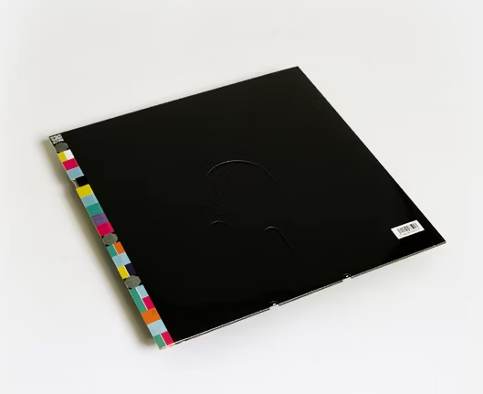
I took inspiration from the colors I see every day - HackTheBox highlight colors specifically, you’ll see the left side bars are comprised of #9F00FF, #004CFF, #FFAF00, #FF3E3E, #9FEF00 (in linear gradient code that I wrote by hand). The colored bar on the side is a nod to one of my favorite records, New Order’s Blue Monday 12” single vinyl sleeve (designed to look like a 5-¼” floppy disk)

And now, as I’ve said before, Onward!
— mike