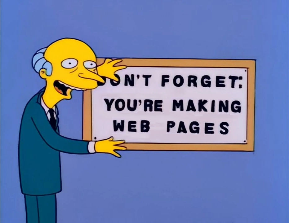
Don't Forget - You're Making Web Pages
As I roll off of an intense assignment at work, I’ve got a bit of free brain space to reflect on the kind of work we’ve been doing, how we have done it, and how this affects — The Future.
(about 15 minutes to read, unless you skip all the footnotes 😉)
We have to go back…
In college, I spent a lot of time in computer labs. Since I was studying Architecture1 and this was the year 19912, this time was split between PCs running DOS3 with AutoCAD4, and VT terminals5 where I used Pine6 to send emails to my brother and my friends at different schools (I can send as many messages as I want? to anyone? for free??)
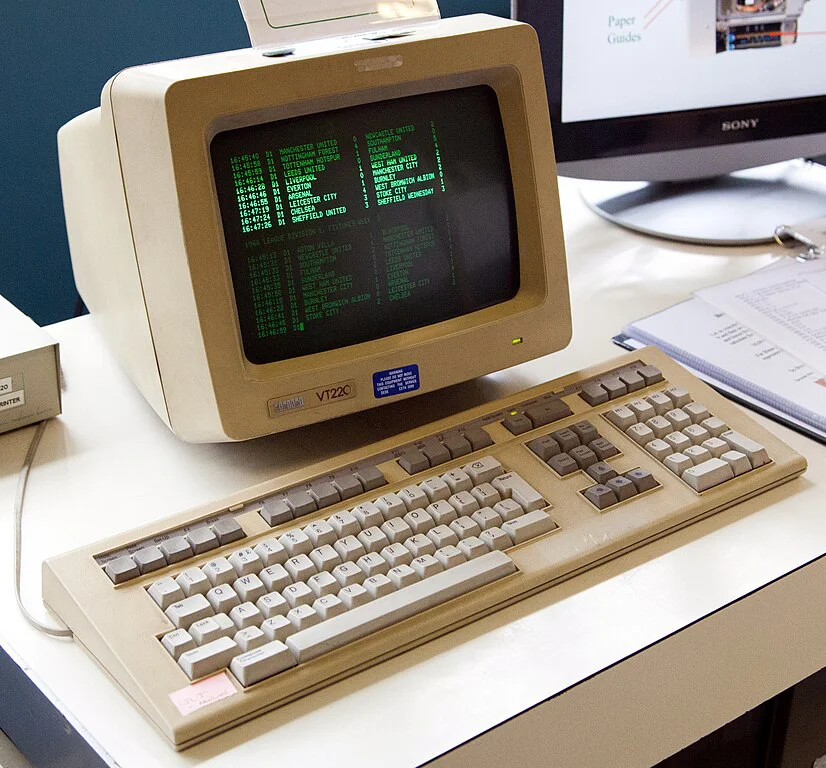
Some time after my account on the VAX7 was created, I noticed a 'public_html' directory appear inside my home directory. I asked the lab monitor what that was - and they explained I could put documents in there that could be be seen by other people on the web. (I can make as many web pages as I want? they can be seen by anyone? for free??)
My first ‘homepage’ was written with the vi8 editor on a terminal. I usually viewed it (and any other web site I wanted to read) using Lynx9.
I was hooked. I didn’t know it at the time, but I would ultimately end up dropping out of the Architecture program, and be hired as the first full-time employee Webmaster10 of my college. But I’m getting ahead of myself.
So here I was, a late teen-turning-twenty-something, with interests and opinions. (they were probably not very good opinions, but that did not deter me.) I created web pages for all of the things i was excited about - TV Shows, Movies, Music. I wrote about my love of these things, I linked to other people’s web pages (for free??) who shared the same interests.
Eventually, I started to notice [INLINE] markup in people’s homepages. I asked my friendly lab monitor about that. I must have finally depleted their patience, as they sighed quietly and suggested I ‘go check out the Mac11 lab.‘
When I first saw Mosaic, everything changed
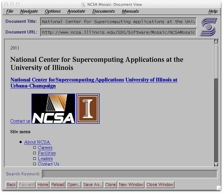
Mosaic12 changed everything for me when I realized that it was possible to embed images, and to add style to your web pages (beyond the bold and italic that I had managed to render in Lynx). I was an Architecture student, and my interests in design dovetailed into industrial and graphic design also. Having more control over the presentation of my content appealed to me greatly.
You can make (almost) anything you want
So while learning new and different ways to affect the display of my web pages, there was always a retropective step — “Does this still work in Lynx?” Why would we care so much? We refused to sacrifice access to our content in the pursuit of something new and shiny. We always checked in other/older browsers.
We hand-wrote HTML. The code that we typed was the exact markup being parsed by the browser. If you saved an HTML document from the web, and opened it up in your text editor right next to your source-code, they would be identical.
This is basic to some of us, but perhaps revelatory to others. And maybe even preposterous to others, still. But this was important, for several reasons.
We cared about the final markup because we were building something to be consumed now and in perpetutity. Web browsers were new, and new ones were being invented all the time. These were not only copycats of functionality with a different wrapper, they were different types of interaction with the content we were producing. Lynx was text-only. Mosaic (and Netscape Navigator13 and Opera14 and Internet Explorer15 and even Cyberdog16 and others17!) were graphical. What was next? 3D18?
We never assumed what was next. Or, more specifically — we never assumed that what would come next would be identical to what we had now. It was easy to see a future where our content would be consumed via (something) that hadn’t been invented yet. And for the most part, we were correct. Eventually we got Web Spiders19 and Search Engines20 and Indexes21. We got mobile phones with WAP22 browsers that would display a pared-down version of our content.
How could we ensure that our content would be readable using technology that hasn’t been invented yet?
Standards
So much of what I learned early on was by viewing the source of other websites, changing my markup, reloading. We were just about to get the O’reilly HTML23 book. Plus the mid-1990s gave us WebMonkey24 and of course the W3C25. By now, (most of)26 the browser makers were creating engines to render standard HTML, so we began writing standard HTML.
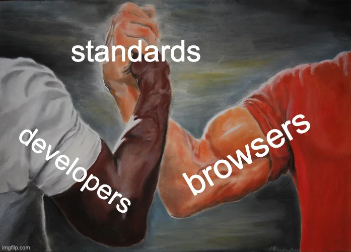
Our hope was that, as long as the (consumer side) of the agreement was planning on rendering content based on web standards, that we would produce content to the same specification. We met in the middle. The code I write today, as long as it is valid, should be readable both in the browsers and consumption methods we’ve already produced, as well as any compliant method that should come in the future.
As time went on, our focus evolved to not only writing standard HTML, but to use it properly. The early 2000s saw a Renaissance27 of this explicit focus, wherein we re-commited to using standard HTML elements semantically. This ensured that (wait for it) browsers and other parsers could determine the meaning and intention of how we organize our content with markup, rather than everything-is-a-div (or a table28).
Back … to The Future!
My biggest concern about the future is — am I the only one who is concerned about The Future? This might sound like a small thing, but it’s a big thing.
A lot of the technology we’ve added to the modern UI development stack is intended to make the developer experience better - to help us to write “better” software, faster. I use the term software here because in terms of complexity, that’s what we’re making.
The practitioners of today have learned about web development in Computer Science curriculums, where they also learned about (compilers, object-oriented languages, databases, etc.). They are conditioned to write software.
And the outlook is … not great
Increasing functionality on the web will necessarily require increasingly complex code. I understand this. And technology-wise, the average device that our audience is using has more capability to parse and understand it than the simple machines that I began using (as long as you have signal and bandwidth). But lately what I’ve been seeing disgorged into the browser DOM is not commensurate with this escalation.
I’ve accepted that libraries and shared components are necessary for modern web development. The days of twee artisanal hand-crafted top-to-bottom websites are probably over (at least, outside of hobbyist pursuits).
I’m not arguing that we should reload and view the built source that is served to the browser with every saved change, read it thoroughly and make sure it’s valid. This would be taxing, and the incremental benefit would not justify the time and expense. But we should do what we can to assure that it is valid and only as complex as it needs to be. Remember, we are still honoring that unwritten agreement between developers and browsers and 🦋.
This is especially important if we are the ones creating libraries, components, and design systems that will be re-used. Our consumers and ultimately their users are relying on us to have put in the dilligence to make sure that are honoring this agreement with all possible Future(s).
But mike - we are time-constrained. Sprint deliverables, deadlines, launch dates. This is true, but we have development tools that can help.
We have the technology

There are tools to help29. We have reference websites for CSS browser compatibility. We have linters that can check the built output of our websites. We have browser dev tools and extensions that can parse for validity and accessibility. We have automated testing frameworks that can render our code and interact with it sight-unseen, and report any difficulties they encounter.
Perhaps most importantly, we have development servers that can hot-reload web browsers when you save changes to documents. I said browsers with an S on the end - how wonderous it is to save a document and see it refresh in a variety of windows / devices / sizes / shapes!
More to my point: “it looks good in Chrome” is not acceptable as your sole success criteria.
If that is how you develop, you are not only abandoning your promise to the Future, but you’re also ignoring your responsibility to the Present.
We have to make the choice

Doing the right thing is a conscious choice. With the pressure we get in our jobs, it’s difficult to justify the time and effort to business people who don’t ‘get it’ and just want the tickets closed as quickly as possible.
So we spend time optimizing our tools and our workflows to be fast. We need to also optimize our tools and our workflows to do the right thing.
We are the only ones who can advocate for our code, our users, and The Future. So extend your cleverness with tooling and optimization (or even your manual routines) to help you create something that will endure.
like Merlin Mann often says (attributed to Jeff Veen), make the right thing the easy thing.
Summary
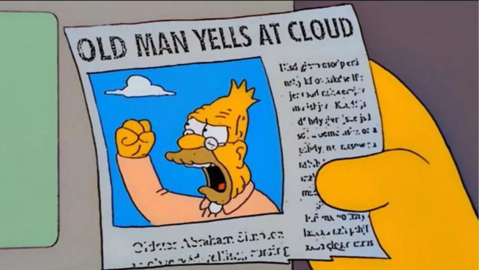
I didn’t write all this to yell at you. (no, really). I implore you to think about the Future in what you build. This was inherent in my journey when I started. I’m not sure where we strayed from this focus.
Maybe newer developers view this as a Career. When I started out, it was a Frontier.
Takeaways, or TL;DR:
- refuse to sacrifice access to your content in the pursuit of something new and shiny
- develop to standards and use html elements for what they’re semantically designed for
- strive to produce code that is valid and only as complex as it needs to be
- broadly test on all available browsers and devices
- consider the baseline of access - maybe not Lynx, but at least account for common problems that thwart and frustrate users30
- check your work with browser extensions like lighthouse & others
And, Ultimately:
Consider that what we create may outlast our membership on a team, our employment at a company, the browsers that people are using today, or even survive longer than us.
The Future is counting on you to do the right thing.
Image Credits:
- “Don’t Forget” graphic is a parody that I made from a frame of the TV show The Simpsons “And Maggie Makes Three” Season 6, Episode 13. Original airdate: January 22, 1995
- VT220 image from Tom Page via Wikimedia
- Screenshot of Mosaic browser by Charles Severance, via Wikimedia
- Developers 🤝 Browsers graphic was made on imgflip.com ‘Epic Handshake’ meme generator. (The original frame is a painting-like rendition of a scene from the film Predator, the actors being depicted handshaking are Carl Weathers and Arnold Schwarzenegger, respectively)
- “Stop it. Get some help” image is a meme now, but it was originally from an anti-drug Public Service Announcement from 1987 starring Michael Jordan
- Red Pill / Blue Pill image by W.carter, via Wikimedia. This is a reference to a film called The Matrix, from the late nineteen-hundreds
- “Old Man Yells at Cloud” image is from The Simpsons, Season 13 Episode 13 “The Old Man and the Key”
Footnotes
-
I began the Architecture program at Wentworth Institute of Technology in 1991. This was the precise time where we started transitioning from paper drawing to Computer Aided Design (CAD) - about half my courses still drew manually (pencils, t-squares, triangles, scales) and half were CAD. ↩
-
1991, or as my kids would call it “the late nineteen-hundreds.” ↩
-
While early versions of Microsoft Windows were available, MS DOS 3.1 and subsequent releases were much cheaper, and a lot of expensive vertical-market software was not compatible with Windows anyway (you could click on an icon in Windows to launch them, and they would abruptly exit windows and load the DOS-based application full screen, without the ability to switch back and forth). ↩
-
At this time, AutoCAD for DOS was far more performant, and I built up quite a muscle-memory for its specific hotkeys. This is the first, probably, in a long list of things that I mastered, and then through updates and the passage of time, became abruptly irrelevant. AutoDesk still makes AutoCAD, having gone through many revisions, to become somewhat of a juggernaut of software to serve not only 2-dimensional and 3-dimensional drawing and modeling, but a new genre of software called Building Information Modeling (BIM). This makes it too expensive for me to tinker with anymore, sadly. ↩
-
Wentworth had several labs of VT220 terminals. I usually gravitated toward the ones with Amber colored displays. ↩
-
Pine was an early terminal-based email program, I don’t recall but I may have actually started using Elm in my first year of college. The administrators would usually create an alias (symbolic link) for common functionality, so users could either choose ‘mail’ from a login menu, or type ‘mail’ in a command shell to be taken to (whatever the configured mail client was at the time) ↩
-
Wentworth had two Digital Equipment Corporation VAX systems, though I do not recall the specific models. The system for staff & faculty was called ‘Bert’ while the system for students was named ‘Ernie.’ I never found out who was responsible for that naming. ↩
-
While I am not one of the ‘I still code in vi’ people, a lot of whom I know and respect, I did use it a lot for coding back then, and I still use it now for editing shell scripts and config files, especially, obviously, when working on a remote server. ↩
-
Lynx and Links are somewhat conflated in my mind, and I’m sure I used them interchangably at various times ↩
-
Webmaster was the term used in acadamia to refer to the person in charge of the organization’s web presence. I’m not entirely sure of the etymology, it calls to mind Dungeons and Dragons (“Dungeon Master”) but ultimately dwindled in usage, to be replaced by more familiar designer / developer /engineer titles. Though at the time, it was much more encompassing — I maintained the hardware and software of the web server, in addition to developing content. The ‘full stack’ started with the computer under my desk (no, really, when I was hired - the web server was the computer under my desk. I moved it to the server room.) ↩
-
The Mac labs at Wentworth in the early 90s were Macintosh Quadra 700 and 800. ↩
-
NCSA Mosaic was the first widely-used graphical browser for the web, followed very quickly by the rest of this list. Wired does well to capture its impact in this article ↩
-
Netscape Navigator very quickly followed Mosaic and was pretty good, until they really pushed for you to download it in a package called ‘Netscape Communicator’ that combined email and calendars and … people didn’t like it. ↩
-
Opera had always been a dark-horse contender in my mind, but consistent. ↩
-
Internet Explorer, when new, was actually quite good. Even the Mac version, which would eventually become bundled with Mac OS (via large investment in Apple by Microsoft) was quite good at the time. ↩
-
Cyberdog was a very short-lived browser by Apple. I was very excited about Cyberdog and OpenDoc in general, both of which went away very quickly. It probably only gets mentioned here due to my misplaced enthusiasm. ↩
-
I’m leaving so many out of this list, or else this post would be even more egregiously long. So many. Really you should read through a lot of wikipedias history of web browsers to get a feel for just how much the landscape was broadening and changing beneath our feet. History of the web browser and List of web browsers are good places to start. ↩
-
No, really, we thought that VRML and 3D browsing might take off. Hey, it still might! ↩
-
The original indexes of the web started out as private, or local, link-by-link indexes of web pages as they were crawled and added to a database. Some of these databases had public interfaces where you could search for topics - at first you had to be very specific about keywords and the syntax that you used, as they did not have fuzzy matching or word stemming or natural language processing. This also meant that when developing, you had to be very explicit to define what your web page was about, if you hoped that people would find it. I remember the day that i first saw my website in WebCrawler ↩
-
Search Engines that were developed as commercial tools were built when companies began to realize that discoverability on the web was something that could be productized and monetized. Back then, it felt a lot less creepy than it does now - the technology didn’t yet exist to target individual users specifically, it was all based on aggregated data. As new search engines were developed and their functionality increased, we (users) hopped from engine to engine. ↩
-
Curated indexes probably became too labor intensive to maintain, but DMOZ was excellent and even Yahoo Directory was a tremendous thing. ↩
-
In the days before smartphones, the mobile phone data landscape was sparse. WAP was a promising development, but device capabilities and network capacity expanded quickly enough that WAP became unnecessary. thankfully. It was rough, y’all. ↩
-
“HTML: The Definitive Guide” was first published in April of 1996. Feeling nostalgic? Check it out on archive.org. I’m not sure when I picked up my copy, but I know it spent many years on my desk and in my backpack. ↩
-
WebMonkey was an excellent resource for cutting-edge markup on the web. It had the style and swagger of Wired Magazine and their other properties like HotWired. A better write-up of its history and ultimate demise here at Wired ↩
-
The W3C was always there, and felt like a stable presence to counter the interests of corporate groups who were pushing for the web to be siloed and controlled. ↩
-
For a while Netscape tried to make their own DOM, but eventually relented, Jeffrey Zeldman himself has the details of that here. ↩
-
Designing with Web Standards became the guide and the justification for shifting to Semantic markup. It also helped that CSS was evolving and allowing us to create complex layouts properly. ↩
-
For some time in the late 90s, web standards and browsers just couldn’t keep up with the demands of marketing and designers and corporations. Before advanced web layouts were possible with CSS, we improperly used data tables for layout. I actually got very good at this, then I stopped. If you need a great example (not my work) you can check out the famous Space Jam website. If you want to see my work, here’s a copy of my website from 1996 (resize your browser - it’s responsive!) ↩
-
Tools I use every day: MDN, Can I Use, Lighthouse in Chrome Dev Tools, IBM Equal Access Toolkit/checker, all the stuff I talked about on my Uses page ↩
-
Common problems that thwart or frustrate users are probably things you’re familiar with: “oops this script didn’t load” or “oops that tracking gif didn’t load” or “oops there was a javascript error” does your website still… function? Have you experienced this as a user, how did it make you feel? ↩